
Everyone is aware of how important it is for a site to be social friendly. Every site that a customer visits can leave a positive or negative impact on them. If they don’t find it to be user or social friendly they immediately fell disconnected.This can lead to high bounce rate and eventually, low traffic too. With so much competition going around, making sure that every crucial element is present on your site, is a compulsion. But how do you know if your website is social media friendly or not? Well, we have made the task easy for you. Below I have mentioned five signs that can make your website anti–social.
Table of Contents
1) Poor Content badly told
A good content is what sells any product and service through social media. Therefore check whether the content that is created is useful to your targeted audience. The content must be share–worthy for your audience as well. Creating poor content along with poor idea can be a disaster for your site too. Users don’t hesitate in unfollowing any brand that doesn’t add any value in their social media feed. Every content crafted by you should be compelling and in sink with the site. Social media audience looks forward to nothing but a relatable and engaging content.
2) Irregular and pointless blog posts
Many of you will agree with the point that a business blog is one of the best ways to promote your business easily. Not to forget that it is cost–effective too. Posting blogs that are irregular and irrelevant to your site can affect your site quality. If you are also committing the same mistake, stop right away as you are making your site anti–social. Also, you aren’t able to get the most out of blogging. Posting quality blog posts regularly can drive insane traffic to your website along with a prominent increase in sales. So, never misunderstand your audience while creating content for your site. Scheduling and sticking to your publishing plan can help you manage your site content on monthly basis. Judging your audience interest and deciding topic for your blog is where you can start from.
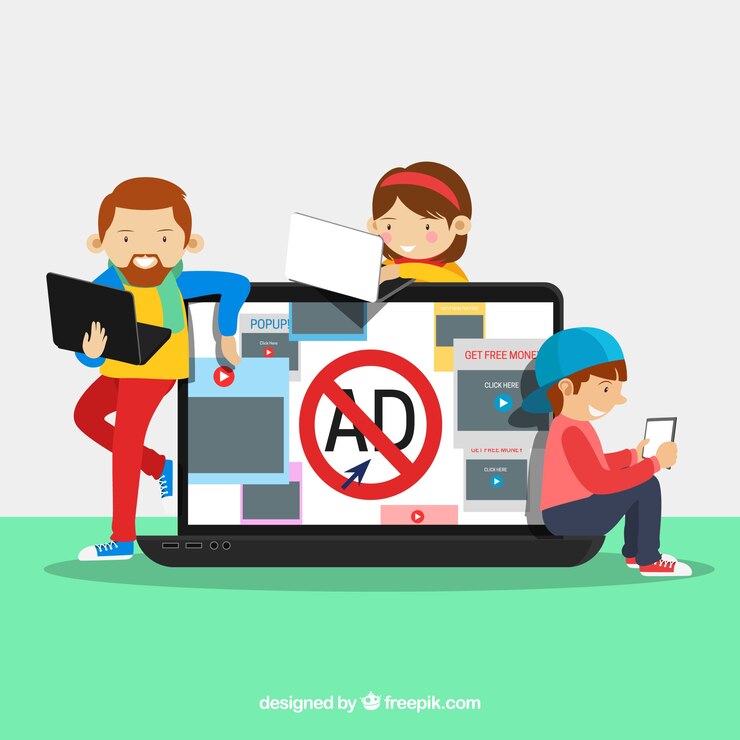
3) Boring Visuals
When talking about online information the first thing that comes up on everyone’s mind is the graphic. Visuals help to communicate the information more clearly and easily to your audience as compared to written information. Therefore, Infographics and memes are getting famous on all the social media platforms. But, many people overlook this point and do not work on visuals resulting in posting boring and unattractive visuals. Just posting visuals isn’t enough, many factors like color, image selection, and many more have a big impact. The audience must get the idea of the image within seconds as people have a short attention span. A highly funny, beautiful or humorous content is all that you need. There are many social media graphics tools out there. You can use them to create attractive visuals for your brand. This tools will help you to create some good social media posts within minutes. You can choose from a variety of templates available on it.
4) Absent or buried social share button
No matter how awesome your content is, if you don’t provide users an easy way to share it, it won’t be able to drive results to your site. A recommendation is what motivates the audience to try a product the most. That means these social shares helps to bring some of the best referral traffic to your site. So, make sure that your site consists of visible social share icons.
5) Not mobile–Friendly
If your site isn’t accessible on various devices, you can lose on new business. For instance, take yourself as an example, how many times do you remember ordering food online via desktop? Very rare, right! That’s the whole point. Just like you find mobile accessibility easy to operate apps or sites, so do your customers.
Now that you know these signs, start working on it. I hope all the above signs helped you to check whether your site is social friendly or not. In case of any doubt do feel free to contact us through comments below. Thank you!
Author bio:

Prince Kapoor is seasoned Marketing Analyst and Blogger. With his skills, he has been helping fellow marketers and brands worldwide. You can reach him out on www.princekapoor.com


